TACGenomics is a genomic service company based in California USA, providing comprehensive solution to the problem of handling data generated by NGS devices.
- 1-(424)-361-5063
- service@tacgenomics.com
- 425 Broadway, Santa Monica, CA 90401 USA
For your project, firstly we will give a detailed QC report of data from raw fastq file to aligned BAM file. Our QC analysis will tell you whether your data is suitable for some specific analysis such as gene fusion or splicing and whether your sequencing depth is enough for expression analysis. Below figures are some examples from our sample project:
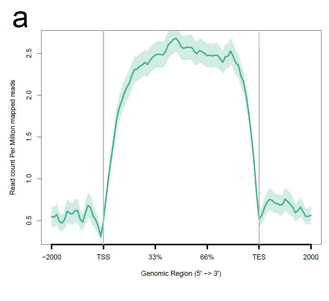
a.The plot of gene body coverage. A good RNA_seq data should have a high uniformity of the reads coverage in the gene body region. Significant 3’bias of the coverage always indicated a degradation of the RNA samples. An even coverage of gene body is required for Gene fusion, splicing and mutation analysis, although it is OK for gene expression analysis.
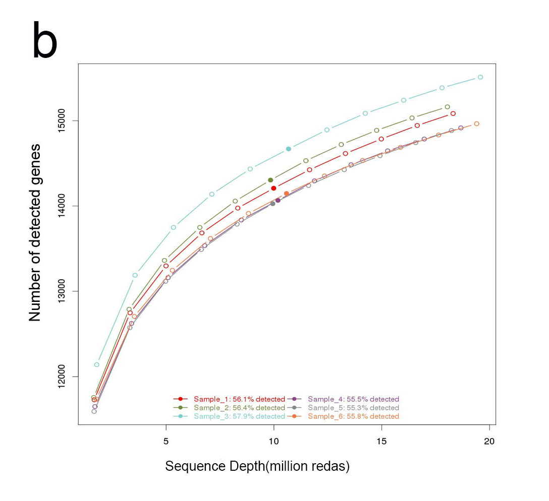
b.The plot of reads saturation. Through the quality check of the reads saturation, we can know if the current sequencing depth was enough or not in terms of ability of detect expressed genes. If less than 50% genes was detected or the curve did not reach saturation, more reads for this sample may required.
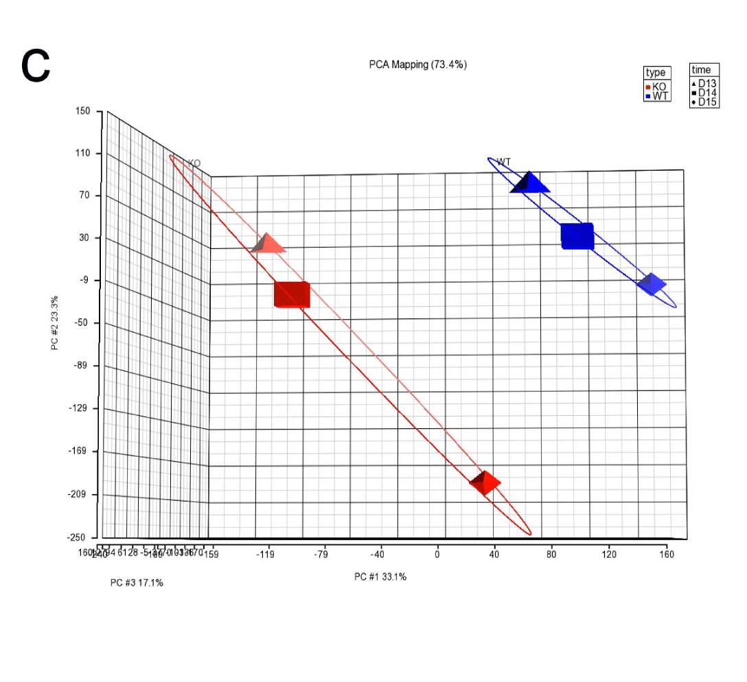
c.The plot of PCA. PCA is an unsupervised analysis of large data sets such as expression level of the whole transcriptome. PCA help you to understand the relative relationship between each sample in 2 or 3-dimensional coordinate space. PCA can identify the outlier of the samples or the potential swap of the samples between groups.
For the result of your data, we will provide the high quality visualization figure of your data. The data visualization will include Heatmap, Pahway and Network. We may also provide the circos plot of the whole genome if applicable. Below figures are some examples from our sample project:
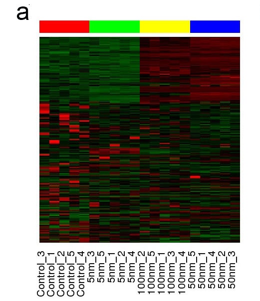
a. Heatmap showing the gene expression across different sample group.
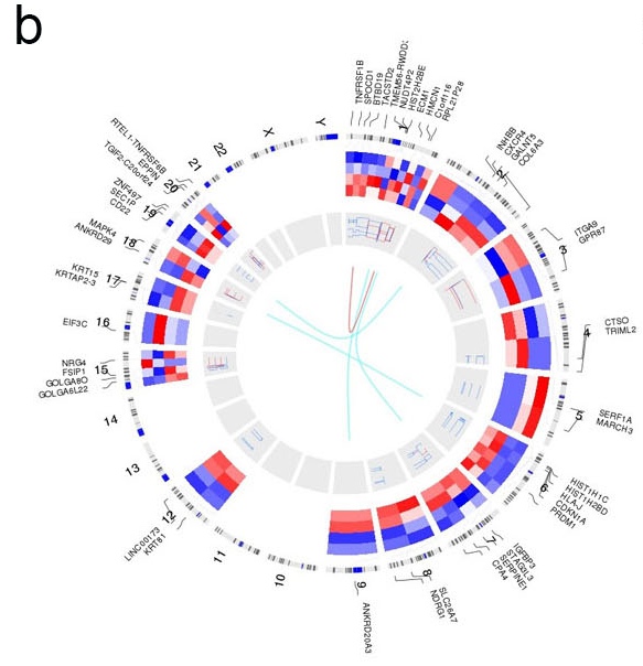
b. Circos plot showing a combination of gene expression (track one), copy number (track two) and gene fusion (track three).
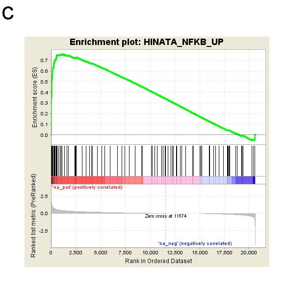
c. GSEA plot showing an enrichment of NF_KB signaling in treatment group.
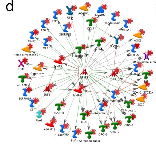
d. Network plot showing an increase of NF_KB signaling in treatment group (same data from c).
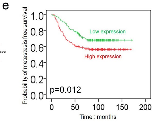
e. Survival plot showing the expression of the gene was related to the metastasis free survival. This is an integration analysis of your data with Oncomine dataset and TCGA dataset.
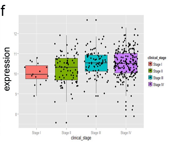
f. Boxplot showing the gene expression was related to clinical stage. This is an integration analysis of your data with Oncomine dataset and TCGA dataset.
TACGenomics is a genomic service company based in California USA, providing comprehensive solution to the problem of handling data generated by NGS devices.